Update #19 — New Software Components (2/2)
JULY 31, 2024
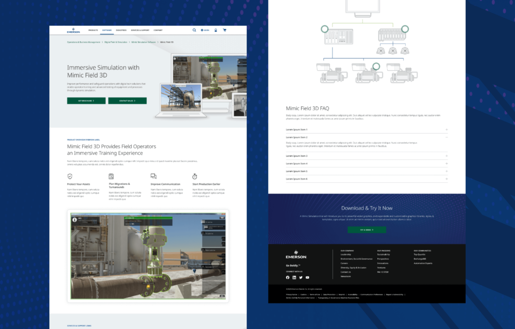
Following our previous update which introduced the first batch of new Software Components, this issue of the Online Style Guide Release Notes showcases the remaining six components from that group which are now available to content editors in CoreMedia. Additionally, we highlight two new layouts specifically geared toward authoring Software marketing page content, with a more modern and engaging look and feel by leveraging these new components.
While these components were developed specifically to support the software user journey, they can have a variety of other uses around the website.
NEW COMPONENT
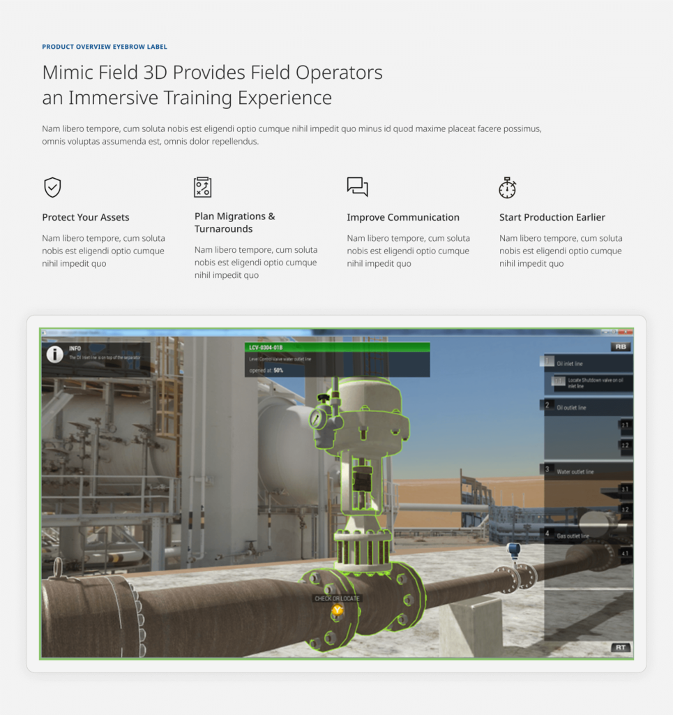
C067B – Mega Flexible Icon Grid with Optional Feature Image
Enhancing the layout options already available in the existing “Mega Flexible” group of components, the C067B allows authors additional customization options to best suit their content needs. These options include enabling the placement of the featured image to display above or below the grid of blurb items, as well as built-in flexibility of the blurb grid itself to optimize the readability and visual balance of blurb content, whether your instance includes 2, 3 or more blurb items.
NEW COMPONENT
C082C – Topic Spots with CTA Icons
This new variant of the Topic Spots components gives editors more flexibility to author different link content types within a C082 Topic Spots list. Each link will automatically inherit the established CTA icon corresponding to link’s content type, enabling editors to easily leverage the Topic Spot design pattern for related content items that may require driving users to a variety of content experiences.
NEW COMPONENT
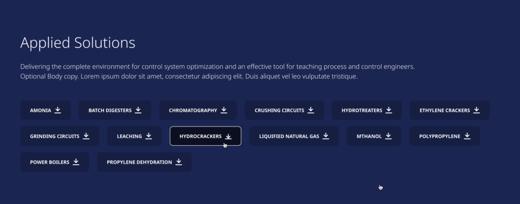
C092 – Background Container Component
The Background Container component is a new wrapper type component, allowing editors to easily style multiple related content components nested within it as a single, cohesive group. This has the ability to help visually reinforce the hierarchy of the page by clearly conveying closely related topical content that may need to be authored separately in 2 or more components. The C092 also gives editors multiple ways to customize the look and feel of the components inside, by combining different combinations of background color, background pattern, and pattern orientation.
NEW COMPONENT
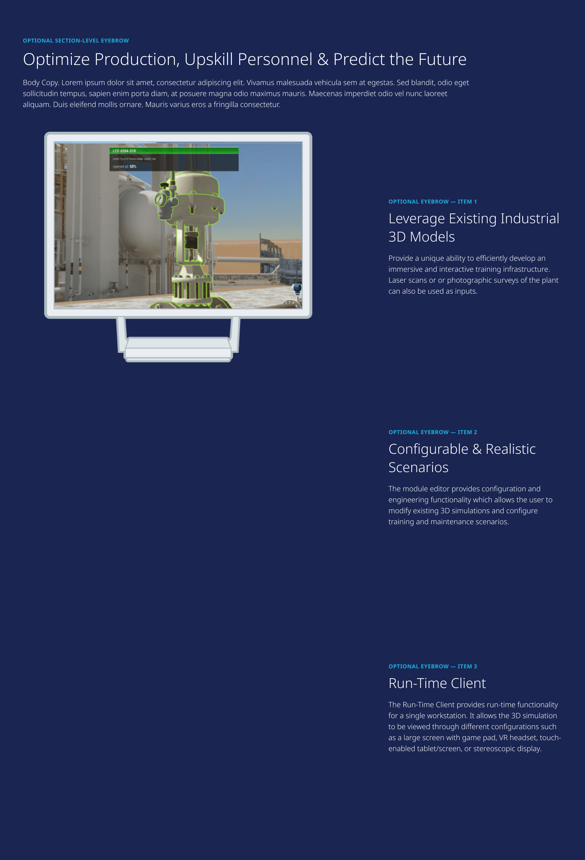
C097 – Featured Content with Dynamic Sticky Image
This visually engaging component promotes a more modern and interactive experience for multi-item feature content. As a user scrolls down the page to the next feature items in the list, the associated feature image remains fixed in place as the other content scrolls by, and the imagery displayed dynamically changes when the next or previous item text scrolls into view.
NEW COMPONENT
VN015B – Centered Navigation Banner
This variant of the VN015 navigation banner allows content editors to author more visually interesting and more robust content than previously possible. The VN015B enables editors to choose the background overlay color to better suit their associated background image theme and light/dark mode text, and allows the authoring of more text content, including an optional Eyebrow Label, flexible description copy length and up to 2 Button CTAs as needed.

NEW COMPONENT
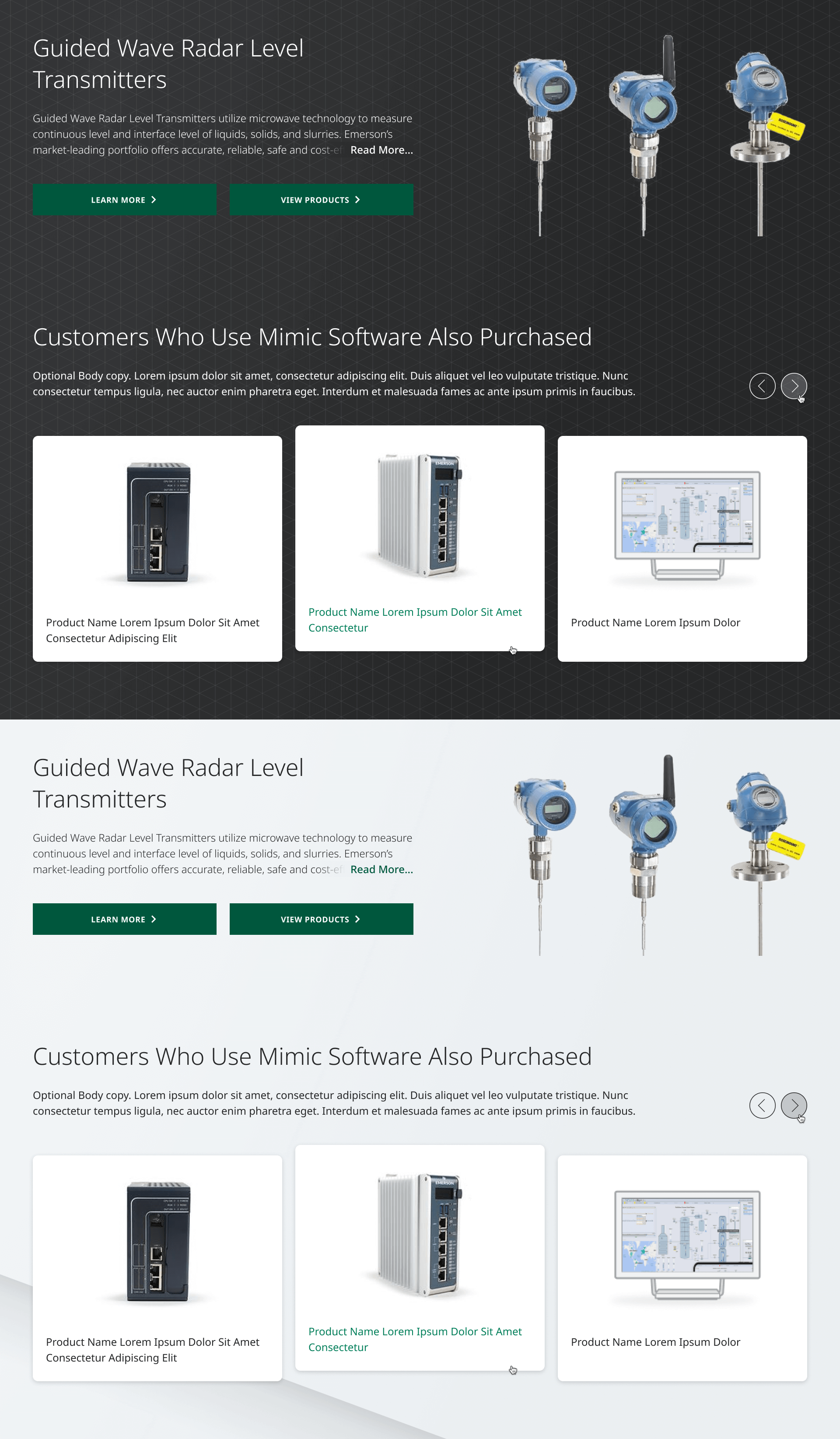
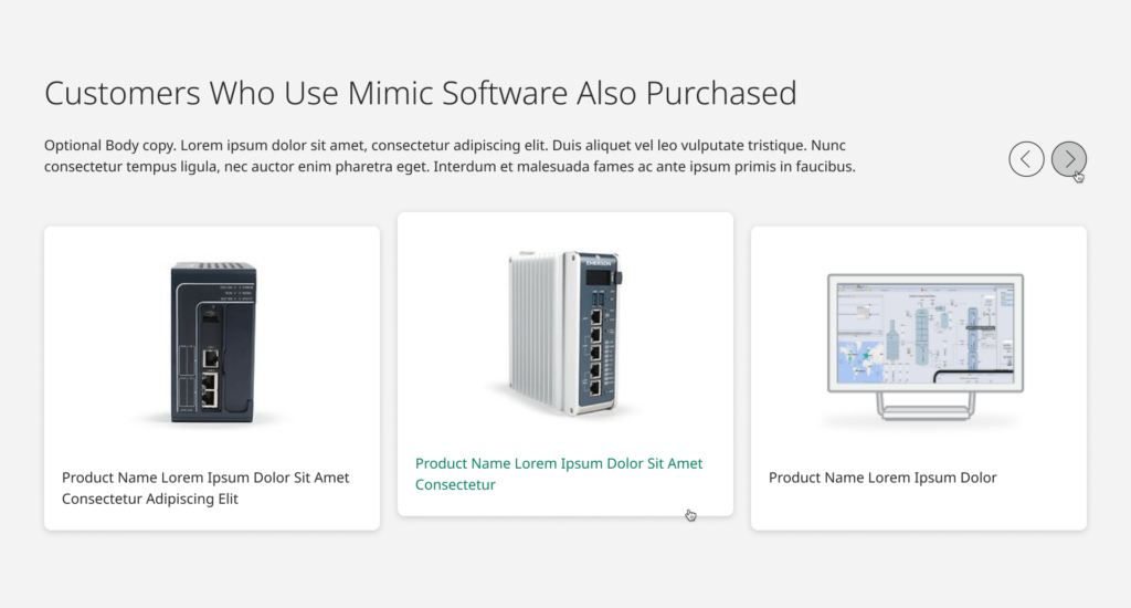
VN021 – Featured Card Carousel
Designed to showcase software products, this new carousel component is intended to feature 3 or more product cards in a clean and modern look and feel. When more than 3 card items are present, the component automatically includes carousel controls in the top/right, allowing users to easily navigate to next/previous items in the group.
NEW LAYOUT
L090 – Software Parent Landing Page
The new Software Parent layout gives content editors the ability to create engaging software marketing pages with a modern look & feel, leveraging the new Software Components outlined above and in the previous Release Notes issue. The intent of this layout is to focus the page narrative on the breadth of Emerson’s high-level software offerings, such as the platform or suite grouping. This provides broader detail than pages about specific subgroupings or individual standalone products, which are better suited for the associated L091 Software Child layout.
NEW LAYOUT
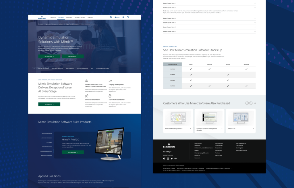
L091 – Software Child Page
Laddering down from its corresponding parent page, the L091 Software Child layout is aimed at providing users a compelling interactive experience. This user experience is built around the narrative of the depth of a specific subgroup of related software products or individual standalone. Utilizing the new Software Components, the page is designed to engage and inform users while showcasing relevant product features, benefits and details such as available product tiers, pricing and FAQs.
