Inline Links
Default

Default
Font Size: (Inherited)
Font Weight: 400 (Book)
Text Color: Brand Primary
Text Decoration: Underline
Hover

Hover
Text Color: Brand Primary (Darken 5%)
Text Decoration: None
Inline (or Body Copy) hyperlinks are those that display within other blocks of content, for example inside a paragraph, an image caption or a table cell. To highlight these links within the surrounding content and convey their clickable behavior to the user, they are styled by default in the primary brand color and include an underline on hover.
Global Navigation Links
Global Navigation Links (Header and Footer) represent special cases and considerations for hyperlink styling and behaviors as these links typically appear in dense clusters—often within multiple hierarchy levels, and are sectioned apart from other webpage content.
Global Navigation Links — Header Menu Items
Default

Default
Font Size: .75rem (12px)
Font Weight: 400 (Book)
Line Height: 1rem (16px)
Text Color: Rich Black
Text Decoration: None
Hover

Hover
Text Color: Brand Secondary
Text Decoration: Underline
Global Navigation Header Menu Item Links are displayed on default as Rich Black text. This style promotes readability and avoids overwhelming users with dense groupings of Green text, which would be the result of using the standard Body Copy/Inline hyperlink styles in the header menu link list. To maintain consistency with standard inline hyperlink styles, individual Header Menu Item Links change to Green/Underlined text on hover.
Global Navigation Links — Utility Menu Items
Default

Default
Font Size: .875rem (14px)
Font Weight: 500 (Medium)
Line Height: 1rem (16px)
Text Align: Right
Text Color: White
Text Decoration: None
Hover

Hover
Text Decoration: Underline
Global Navigation Utility Menu Item Links represent a subset of the Global Header Menu that focuses on corporate and account-related menu items, such as Contact Us and Sign In. Due to this menu having a dark background color, these links display in White Text to promote readability. To maintain consistency with standard Inline Link and Header Menu Item Link styles, individual Utility Menu Item Links are underlined on hover.
Global Navigation Links — Footer Menu Items
Default

Default
Font Size: 1rem (16px)
Font Weight: 300 (Light)
Line Height: 1.5rem (24px)
Text Color: White
Text Decoration: None
Hover

Hover
Text Decoration: Underline
Global Navigation Footer Menu Item Links are displayed over a dark background and display in White Text to promoted readability. To maintain consistency with standard Inline Link and Header Menu Item Link styles, individual Footer Menu Item Links are underlined on hover.
Global Navigation Links — Footer Legal Items
Default

Default
Font Size: .75rem (12px)
Font Weight: 500 (Medium)
Line Height: 1rem (16px)
Text Color: Warm Grey
Hover

Hover
Text Color: White
Global Navigation Footer Legal Item Links are a subset of Footer Menu Item Links. As less prominently visited links, these are styled somewhat differently to differentiate them in the Footer Links hierarchy. They are displayed as Grey Text by default and change to White Text on hover.
Tab Label Links
Tab Label Links allow the user to navigate to, or advance through, content located within the same webpage (or content group) they are currently viewing as opposed to directing them to another location on the site or external sub-domain. Because these do not "link-out", they are styled differently to distinguish them from other standard Inline or CTA Label Links, and do not include Link Arrows. Often these will include a background color or underlining border to denote the Selected, or Active, content currently being displayed from the other optional content available within a page or group.
Tab Label Links
Default

Default
Font Size: .75rem (12px)
Font Weight: 600 (Semibold)
Line Height: 1rem (16px)
Text Color: Rich Black
Text Transform: Uppercase
Hover

Hover
Text Color: Brand Primary (Darken 5%)
Selected

Selected
Text Color: Brand Primary
Tab Label Links are generally used within most tabbed components since the style conforms to site-wide Label styles and promotes readability on standard section backgrounds. The label text changes from Rich Black to the Brand Primary color for Selected state or to the Brand Primary color darkened 5% for Hover state to convey their interactivity to users. They also may include background color or underlining border styles in some interaction use cases. Some examples include C016 Horizontal Tabs, C030 General Documents & Drawings and Search Results page Zoned Tabs.
Reversed Tab Label Links
Default

Default
Font Size: .75rem (12px)
Font Weight: 600 (Semibold)
Line Height: 1rem (16px)
Text Color: White
Text Transform: Uppercase
Tab Color: Brand Primary
Hover

Hover
Tab Color: Brand Primary (Darken 5%)
Selected

Selected
Tab Item
Tab Color: Brand Primary (Darken 5%)
Bottom Border: .25rem (4px) White
Reversed Tab Label Links are generally used only when the tab area or group has a dark or colored background to promote readability. Instead of changing text color for Selected and Hover states, these typically use additional visual elements such as background color changes or the addition of an underlining border color to convey their interactivity to users. The primary example of Reversed Tab Label Links is the VN004 Jump Navigation Tabs.
Title Links
Default
Default
Font Size: .875rem (14px) or 1rem (16px)
Font Weight: 400 (Book) or 500 (Medium)
Line Height: 1.5rem (24px)
Text Color: Rich Black
Hover
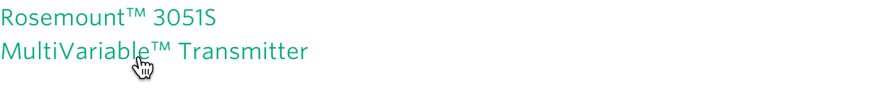
Hover
Text Color: Brand Primary
Title Links connect the user to additional content from an item teaser such as a product carousel, or may allow the user to download certain content such as product documentation. Since teaser titles typically stand apart from other content, instead of highlighting these by default like Inline Links they are displayed as Rich Black by default and change to Green Text on hover. Examples of Item Title Links include C006 4-Column Product with Carousel, C009 Latest News, C029 Case Study Document Strip and C030 General Documents & Drawings