Usage Guidelines:
When to Use:
For primary calls to action
When to Avoid:
Don’t use when hyperlinks within body copy are the appropriate application.
Buttons and CTAs serve as a recognizable, visual way for users to navigate to other pages on the site, find additional information (e.g., to a PDF) and/or load more information (e.g., a social post preview).
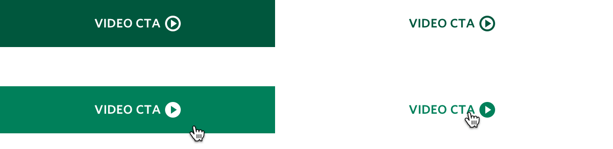
Buttons and most CTAs throughout Emerson.com are enabled to allow content authors to select which content type they want the CTA to target, including internal and external page links, downloadable content, and video content. CTA content types can often be co-mingled in the same CTA group or component as needed. Each of the four CTA content types are styled with their own distinctive content icon and interaction behavior, as shown below.
Color: Same as CTA text
Height: 1rem (16px)
Width: 1rem (16px)
Margin Left: .25rem (4px)
Color: Same as CTA text
Transition: Icon moves to the right by .25rem (4px)
Color: Same as CTA text
Height: 1rem (16px)
Width: 1rem (16px)
Margin Left: .25rem (4px)
Color: Same as CTA text
Transition: Icon moves diagonally upward by .25rem (4px) and to the right by .25rem (4px)
Color: Same as CTA text
Height: 1rem (16px)
Width: 1rem (16px)
Margin Left: .25rem (4px)
Color: Same as CTA text
Transition: Arrow moves down by .25rem (4px) touching the underline below
Color: Same as CTA text
Height: 1rem (16px)
Width: 1rem (16px)
Margin Left: .25rem (4px)
Color: Multiple (see Transition specs)
Transition: Icon's circle background fills with same color as the CTA text; triangle color changes to match the button (or component) background color
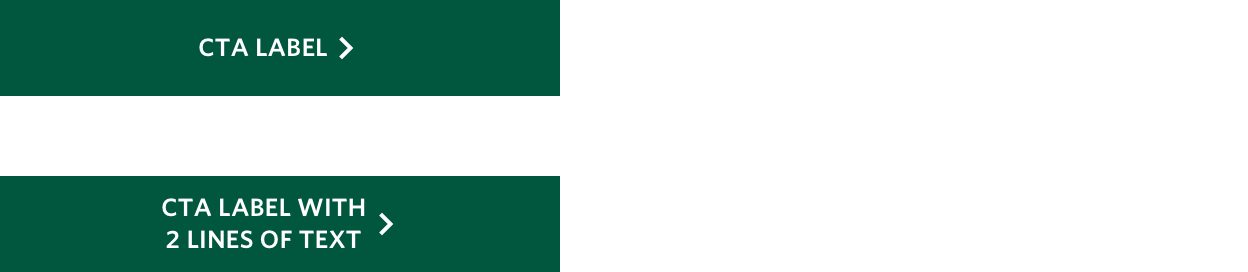
Buttons serve as a convenient way for users to navigate to other pages on the site, find additional information (e.g., a PDF) and/or load more information (e.g., social post previews). “Call to Action” buttons on the new website are designed to accommodate up to 22 characters across one row of text. In cases where you need to write a longer call to action, try to use links, not buttons.
Ideally, use the CTA buttons as an invitation for a user to take a next step. Use short, verb-driven phrases. This pithy approach will keep buttons limited to one row of text and will give the page a cleaner, more visually appealing feel. CTA example text:
Button Color: Brand Primary
Button Border: None
Font Size: .75rem (12px)
Font Weight: 600 (Semibold)
Line Height: 1rem (16px)
Text Transform: Uppercase
Text Color: White
Icon Color: White
Icon Spacing: .25rem (4px) left

Button Color: Brand Primary (Lighten 8%)
Icon Transition: See CTA Icon specs by content type above
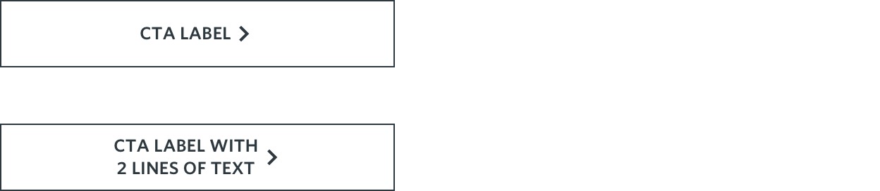
Button Color: Transparent
Button Border: Rich Black
Font Size: .75rem (12px)
Font Weight: 600 (Semibold)
Line Height: 1rem (16px)
Text Color: Rich Black
Icon Color: Rich Black
Icon Spacing: .25rem (4px) left

Button Color: Cool Grey
Icon Transition: See CTA Icon specs by content type above
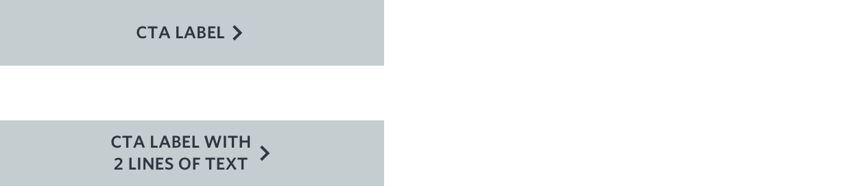
Secondary Button CTAs can be used throughout a given web page, but are particularly appropriate when used for information that isn't critical for the user to access.
Button Color: Cool Grey
Button Border: None
Font Size: .75rem (12px)
Font Weight: 600 (Semibold)
Lien Height: 1rem (16px)
Text Color: Rich Black
Icon Color: Rich Black
Icon Spacing: .25rem (4px) left

Button Color: Cool Grey (Darken 8%)
Icon Transition: See CTA Icon specs by content type above

Button Color: Transparent
Button Border: White
Font Size: .75rem (12px)
Font Weight: 600 (Semibold)
Line Height: 1rem (16px)
Text Transform: Uppercase
Text Color: White
Icon Color: White
Icon Spacing: .25rem (4px) left
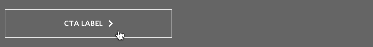
Icon Transition: See CTA Icon specs by content type above
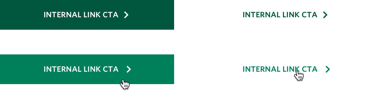
Text CTAs most commonly are those that punch-out to additional or external content located either within another Emerson.com webpage or on a separate sub-domain. Similar to buttons, Text CTAs sometimes allow authors to configure one of the additional core content types (downloads, videos) to be triggered when the CTA is clicked depending on the use case or the component authored. Also like buttons, Text CTAs may not always require an associated CTA icon (e.g., H002B Hero with Jump Links). Essentially the only notable difference between Button CTAs and Text CTAs is that the latter do not display a button background or border.

Font Size: .75rem (12px)
Font Weight: 600 (Semibold)
Line Height: 1rem (16px)
Text Transform: Uppercase
Text Color: Brand Primary
Icon Color: Brand Primary

Text Color: Brand Primary (Lighten 8%)
Icon Color: Brand Primary (Lighten 8%)
Icon Transition: See CTA Icon specs by content type above
Primary Text CTAs are generally used for linking to the full, unabridged version of a piece of content from an item teaser (e.g., “Read More” links on C009 Latest News cards), or in certain cases may initiate the download or video player of associated content (e.g., C080 Flex Cards).

Font Size: .75rem (12px)
Font Weight: 600 (Semibold)
Line Height: 1rem (16px)
Text Transform: Uppercase
Text Color: Rich Black or Brand Secondary
Icon Color: Same as text color

Text Color: Brand Secondary
Icon Color: Brand Secondary
Icon Transition: See CTA Icon specs by content type above
Secondary Text CTAs are generally used within the Global Header Navigation, specifically when a Segmented Submenu Header Label is linked to a corresponding high-level webpage containing more content than can be included within the submenu list.

Font Size: .75rem (12px)
Font Weight: 600 (Semibold)
Line Height: 1rem (16px)
Text Transform: Uppercase
Text Color: White
Icon Color: White

Icon Transition: See CTA Icon specs by content type above
Reversed Text CTAs are generally used to promote readability in cases where the CTA content displays over a dark or colored background (e.g., P001–P007 Promo Box components), or when it overlays a background image (e.g., H001B Homepage Segmented Hero and H002B Hero with Jump Links).