Update #18 — New Software Components (1/2)
MARCH 22, 2024
This issue of the Online Style Guide Release Notes introduces several new components now available for authoring in CoreMedia. Designed for showcasing product content on Software marketing pages, these components enable editors to flexibly feature Emerson’s software product offerings in a modern and visually engaging way with several components that incorporate compelling and dynamically interactive animations.
While these components were developed specifically to support the software user journey, these components can have a variety of other uses around the website. This first available batch covered here consists of nine new components. Look for a follow up Release Notes to feature the remaining six once they are fully implemented and available for use.
NEW COMPONENT
H002D – Hero with Jump Links and Optional Video Loop
Combining features and functionalities previously only available in separate hero components, the H002D hero allows editors to configure it with optional breadcrumbs, jump navigation links driving users to key content sections lower on the page, and either a still background image or an ambient background video clip that autoplays on loop. Similar to other newer hero components, the H002D is flexible and accommodates a variable amount of heading and intro text, and up to 2 CTAs as needed helping inform users of the page topic, compelling them to explore the supporting content below, or guiding them into a sales flow.

NEW COMPONENT
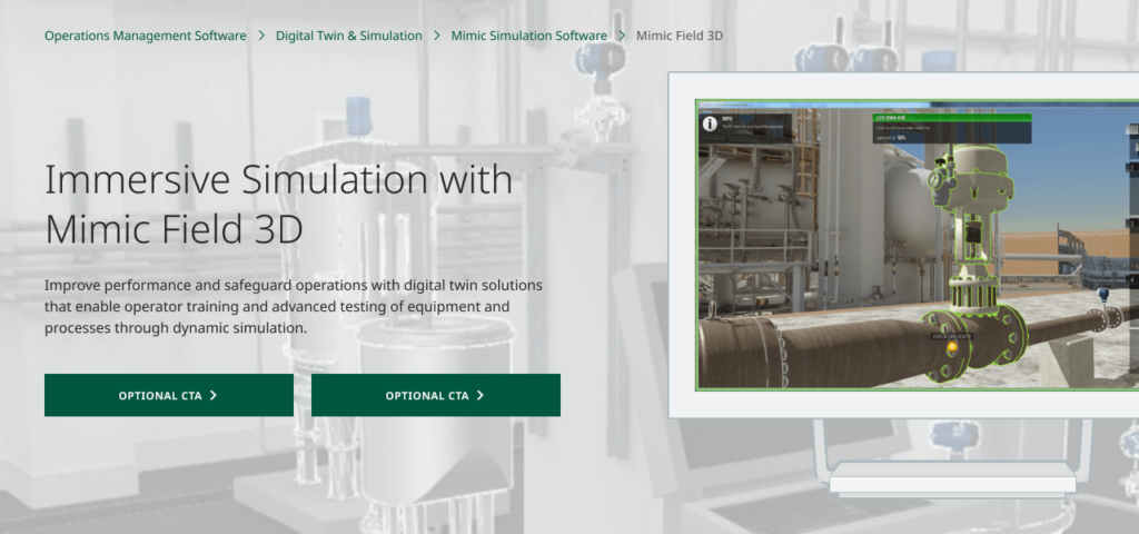
H002E – Hero with Foreground Image
Designed for showcasing visually compelling software product imagery above the fold, the H002E hero allows editors to feature a foreground image overlaying the image or solid color background. This foreground image is intended to give users a visual teaser of the exciting software or product offering they’ll learn more about lower on the page. The hero flexibly adapts to accommodate a variable amount of heading and descriptive intro text, allows up to 2 CTAs, and can optionally be configured to display breadcrumbs as appropriate.
NEW COMPONENT
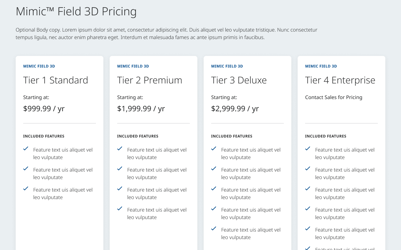
C020B – Multi-Column Product Tier Comparison
As a variant of the existing C020 Comparison component, the C020B is intended to help illustrate specific features and benefits that better helps users differentiate between levels or tiers of the same product offering or software suite, allowing users to easily identify which best suits their unique needs and use cases. Each product column allows the authoring of tier-specific pricing or sales contact info, distinguishing features and functionality formatted in bullet points with supporting iconography, and up to 2 CTA buttons driving users to actions such as starting a product demo or contacting sales as they progress down the funnel toward a potential conversion.
NEW COMPONENT
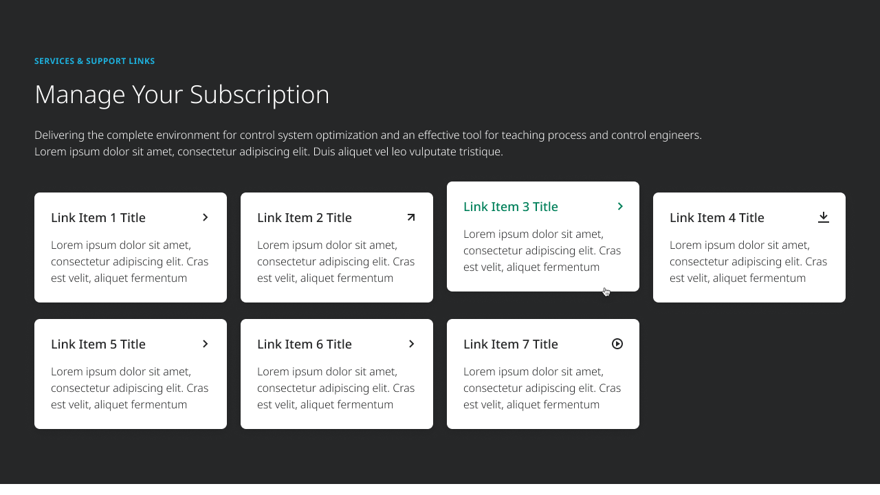
C080B – Expanded Flexible Card Grid
Intended for flexibly displaying a variable number of links to supporting content or resources associated with the topic of the page, the C080B enables editors to author a grid of 2 or more card links which help users easily navigate to the content they need. This component allows all CoreMedia link content types and each link card displays the corresponding CTA icon based on the linked content similar to existing global CTAs.
NEW COMPONENT
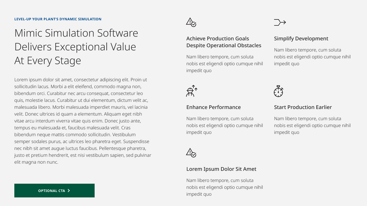
C091 – Flexible 2-Column Feature with Icon Grid
Similar to other existing Flexible Column components (C067–C070), the C091 gives editors an alternate layout option for displaying page content and compelling supportive content blurbs. Intended for informing users on a given software or product offering, this component allows editors to author an optional section eyebrow label to denote the theme or topic of the content, a variable amount of heading and informative body text, an optional CTA, and 2 or more supporting blurbs displayed in a grid orientation.
Each blurb is ideal to briefly highlight a key feature, functionality or associated user benefit in teaser format and includes a topic-relevant icon, title text and description copy. While this component flexibly adapts to accommodate a variable amount of content it may contain, it is recommended not to exceed 8 blurb items when possible ensure the content displayed is visually balanced and easily digestible.
NEW COMPONENT
C093 – Vertical Content Tabs
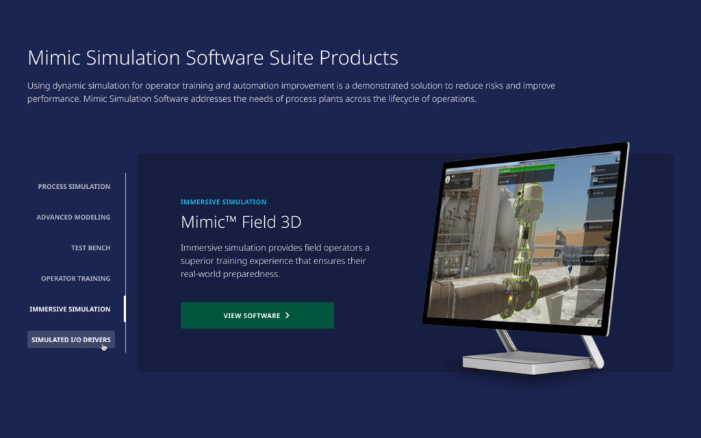
Intended for showcasing software product content in a condensed yet visually compelling way, the C093 both leverages recent updates to our vertical tabs design pattern and enhances it to allow for aesthetically engaging product glamour shot imagery. This component enables editors to author 2 or more tab items focused on highlighting related product offerings, such as products within a suite, or key product features.
Each tab card can be authored with an optional eyebrow label, descriptive subheading and body text, CTA button and an in-situ product image. For the associated images to look and feel as modern and compelling as possible, it is recommended that all image assets used in this component should be formatted to display against transparent backgrounds.
NEW COMPONENT
C094 – Timed Accordion with Images
Taking a new, more modern approach to accordions, the C094 enables editors to present accordion content to users in a more visually engaging and dynamically interactive way. On page load, the Timed Accordion component is set to autoplay and loop through the successive display of each accordion in the group, animating the reveal of each item’s associated text and CTA content as well as a corresponding illustrative image to the left (on desktop).
Users can disable the autoplay animation at any time by selecting one of the accordion items of their choice to reveal its content and learn more. Once the autoplay animation is stopped it will not restart unless the page is reloaded. As with other software components introduced here, it is recommended that image assets used in this component should be formatted to display on transparent backgrounds to maintain the modern look and feel intended.

NEW COMPONENT
C095 – Featured Stats
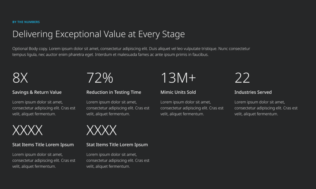
Intended for highlighting data and figures related to key product benefits and proof points, the C095 allows editors to author 2 or more featured stat items corresponding to the main product offering or topic of the page. While no images are included in this component, it leverages a subtle yet engaging visual interaction by successively fading each stat item into view as the user scrolls the component into the viewport. Each stat item allows the authoring of a visually prominent alpha-numeric data callout and associated subheading and description text. This component does not include CTAs, but hyperlinks may be authored within the items’ body text if needed.
NEW COMPONENT
C096 – Timed Content Carousel
Designed to give a stylistic upgrade to case studies and user story content, the C096 is intended to showcase 3 or more interactive carousel tiles featuring content that showcases how Emerson delivers customer benefits. Like many of the new components introduced above, this carousel integrates a dynamic autoplay feature which successively reveals the tile content of each item in the group, giving users a more engaging experience with the stories included.
Each tile includes a background image with programmatic color overlay, a monochromatic logo of the associated client brand, content type label and descriptive teaser text and a CTA button linking to the full text of the case study or corresponding content piece. Users can disable the autoplay animation at any time by selecting any of tiles or navigating the carousel via the toggle controls above.
