Update #10 – Rich, Flexible Components: The Extended Sites Issue
JULY 21, 2021
Emerson’s top-rated consumer brand, Sensi, had previously designed a set of stylish marketing components on their old platform. When Sensi joined the Emerson.com platform (at sensi.emerson.com), their favorite components were re-created for use on CoreMedia. Now all businesses can incorporate these components into their own Emerson sites and/or campaigns to promote apps, news products and product specs.
Many of the components covered below heavily utilize iconography to both support the context of the copy as well as to boost the visual interest and engagement of the component. While some use cases for these components may require their own unique icon assets, any new icons created should be styled to fit cohesively and consistently within the established One Emerson iconography look and feel. For more information on how to create new icons that achieve this, please refer to the the Iconography Style Guidelines.
NEW COMPONENT
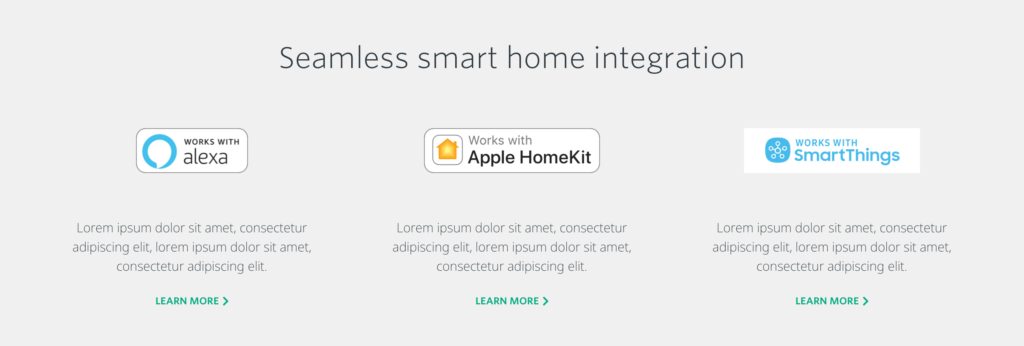
C063 – Flexible 3-Column Promotional Banner
A flexible three-column component that features supporting promotional, product benefit, or partner related content teasers with links to child pages for additional information. The C063 showcases 2-3 grid items of supplemental content related to consumer-focused product benefits, partners or promotions, helping to illustrate the greater product ecosystem.
NEW COMPONENT
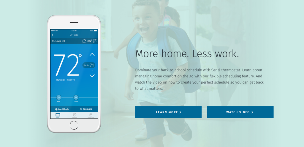
C064 – Full Bleed Background Image
A visual approach to a mid-page content block, offering the opportunity to feature a wide range of content types and provide links to related pages. Authors can utilize this color-block content feature to add dynamic visuals to their page. This component is great for briefly highlighting long-form content, product features, case studies, etc., and linking out to more information on the topic.
NEW COMPONENT
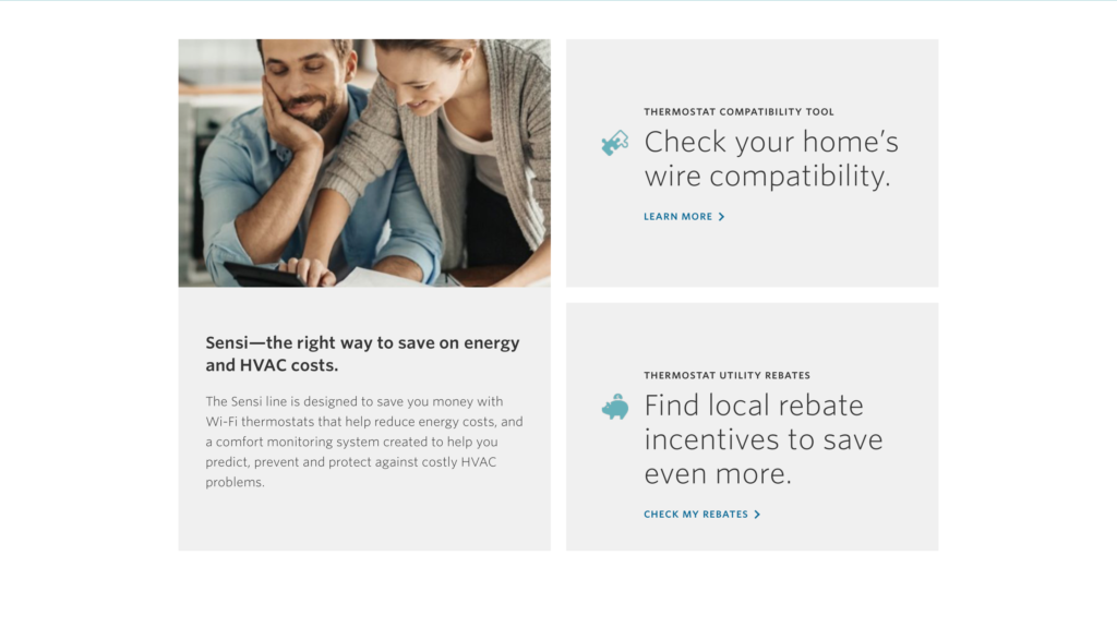
C065 – 50/50 x 3 Grid
This two-column, 50/50 text and image tile combination features three content blocks. The tile on the left shows an image with a headline that speaks to the entire component and paragraph text that communicates an overarching value or reason to believe. The text blocks provide more detail, with the eyebrow label text identifying the feature, the large body text describing the user benefit, and the CTA text offering an action the user can take.
NEW COMPONENT
C066 – Centered Feature Copy w/ Image or Icon
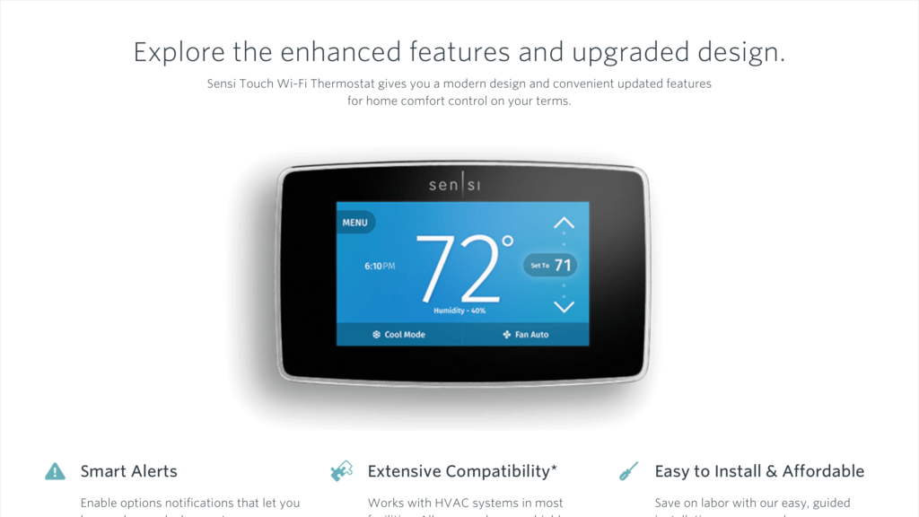
A text-based color block promo featuring iconography, this component is intended to highlight a specific feature or value proposition. The component heading text should succinctly state the key value, while the description copy below provides supporting details. C066 can be placed mid-page to break up heavier content or used as a closing component at the bottom of a page.

NEW COMPONENT
C067 – Mega Flexible Multi-Column Component
As the name implies, this is a flexible multi-column design component that can be assembled in a number of configurations. The C067 component allows authors to configure up to three columns of content, with optional header and description copy, feature image, proof point subheading and detail copy (with or without accompanying iconography to help visually represent or illustrate their corresponding point) and CTAs.
NEW COMPONENT
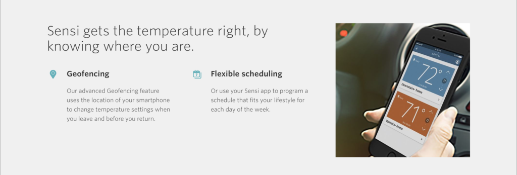
C068 – 2-Column w/ Image Right
Use this component to highlight two product features or proof points and add visual style to a page. The header text can serve as the key value prop and/or speak to the general purpose of the product or service offered. The offerings listed in the two columns should feature relevant icons that follow Emerson iconography guidelines. The subtitles for offerings should show one to two words that explicitly state the service, and a short sentence with further details should follow.
NEW COMPONENT
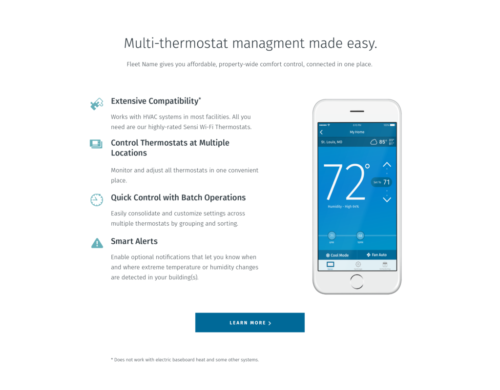
C069 – Flexible 3-column w/ Icons & Image Right
Ideal for a digital product or service feature; also perfect for highlighting any key points with supporting visuals. The C069 is a tall component that expands vertically to accommodate multiple proof points for a right-aligned product or service feature image, with an optional CTA displayed at the bottom of the component, center-aligned.
NEW COMPONENT
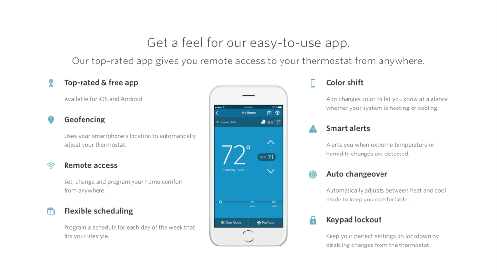
C070 – Flexible 2-Column w/ Icons and Centered Image
The C070 offers the opportunity to highlight a feature image front and center, flanked by supporting product or service value props. The component’s headline is used to feature a brief value statement of the product or service offered, with dedicated H2 sub-heading copy used to name the offering and additional value that leads into the proof points below, with optional accompanying iconography.
NEW COMPONENT
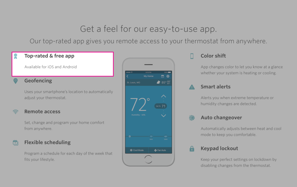
C071 – Flexible 3-column Blurb (Sub-Component)
The C071 Flexible Blurb is a sub-component copy block item which is used to create the proof point bullet content in the Flexible Column collections for C067, C068, C096 and C070 components.
NEW COMPONENT
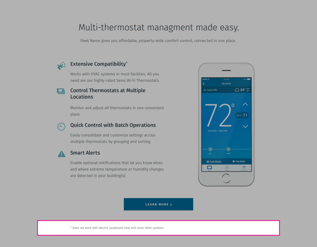
C072 – Flexible 3-column Footnote (Sub-Component)
A sub-component of C067, C068, C069 and C070, this text block provides the opportunity for authors to add pertinent exemptions, disclaimers or notes to any of the information displayed in the component above. It is recommended to begin with a star to help catch the user’s attention.
NEW COMPONENT
C073 – Tall Banner
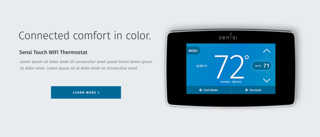
The C073 Tall Banner’s primary purpose is for use as a Hero for product pages or as a featured content block. It can still serve that purpose or can be used as a product or service feature with an optional CTA. This tall banner is intended for highlighting content that needs space to shine.
*Note: This Hero was originally designed for the Sensi eSite as a way to feature a graphic image in a hero with a solid background using the “Background Color” setting. Check with your platform governance before using this hero as it is not a standard hero in any page layout.
