Moodboard Inspiration

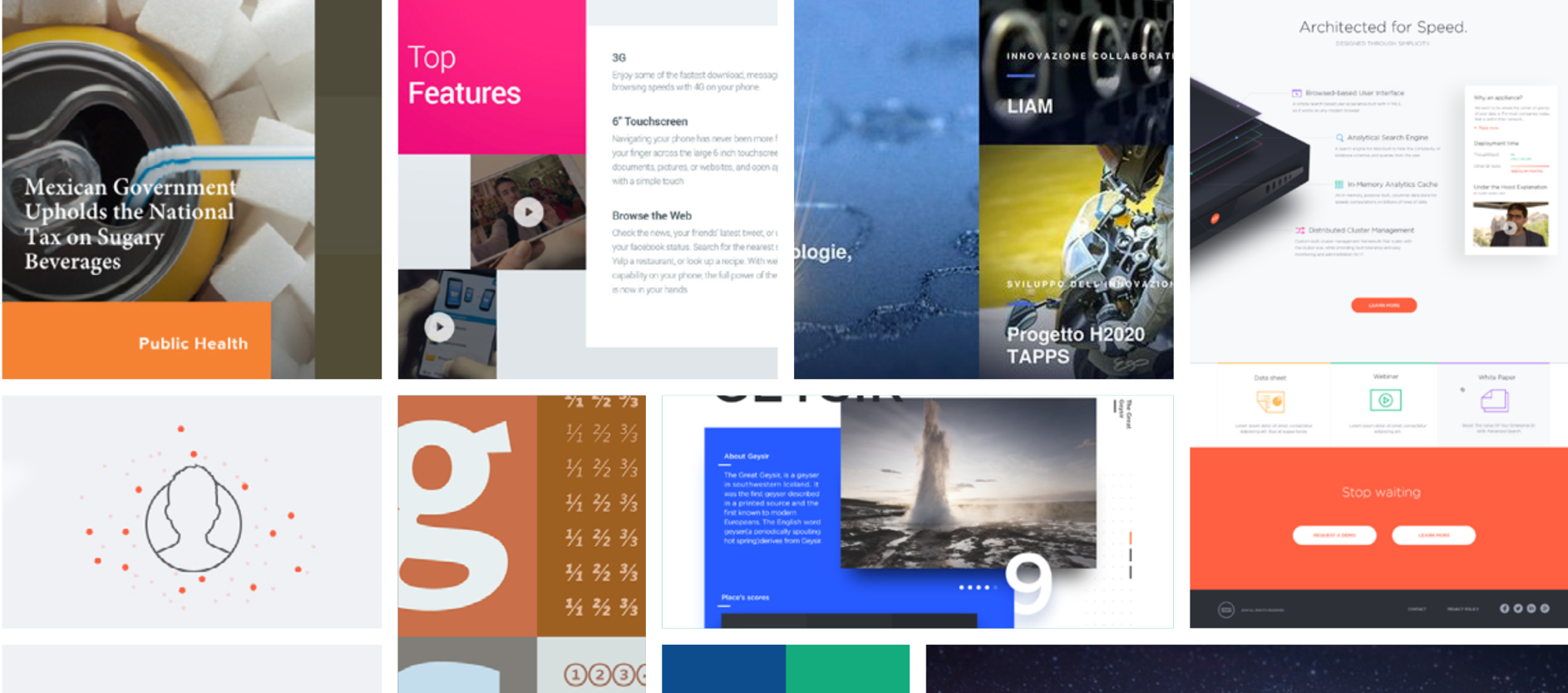
The image guidelines provide direction in the following areas:
Inspiration – a mood board that captures the visual intent of the site
Responsive Considerations – thinking about how your images will appear across viewports
Image Styles – selecting an image that fits within 5 approved approaches
Image Manipulation and Ratios – optimizing your images in the CMS
Image Styles to Avoid – images that don’t fit the new website style


For a responsive site such as Emerson.com, it is important to use high resolution images and, at the same time, balance the need for fast load times. While high resolution images are important, remember to pre-process them so that they are optimized for the web through your photo-editing software (such as Adobe Photoshop). The CoreMedia CMS does not have image-processing functionality or the ability to serve up different-sized images per device (e.g., mobile, retina display, 4k monitors, etc.). So it is important to use this pre-processing step to ensure smaller image file sizes that can work adequately across both large monitors and small mobile devices. Try to save files for the web at 60% quality, and adjust and optimize as needed depending on the complexity of the image. The more complex the composition of the image is, the higher the file size is likely to be, and more compression may be required, or another image may need to be selected to keep down file size.
For images that will be used as hero images (1440×500), try to keep them under 500kb (.5mb). For images that will be used as medium-sized photos in the body of the page (i.e., 400-800 pixels wide on desktop), keep them under 100kb when possible. For images that will only be used as thumbnails (i.e., less than 400 pixels wide), keep them under 25kb when possible.
Use PNGs for larger infographics and illustrations. Use JPG files for everything else.
Question: Should I still save my image files at 144 DPI? Yes, this will not affect file size and ensures high-quality print-outs of the webpage.
Our recommended visual style is to select images taken through a camera lens that present engineering in a unique, abstract way while conveying meaning at both the metaphorical and literal level. A mix of accuracy and art, intrigue and delight, should guide the selection of images that appear on the home page and important second-level landing pages. When selecting images to meet the standards of the new website, consider factors such as interesting use of patterns, symmetry, angles, times of day and other distinguishing attributes.
As the user delves deeper into the site, the emphasis on accuracy should be weighted more heavily than the artistic quality of the photo. To this point, when the user visits the Product Catalog or the Product Details Pages, the product shots should all be consistently presented. Please note: some brands may not have the recommended type of product image available for the first release. A transitional period should be afforded to allow these brands to re-shoot their products in order to give the product catalog pages a more consistent look and feel.


Meeting our preferred image style can be challenging, and not all pages will always be able to comply with such lofty artistic ambitions. Therefore, our secondary style leans on a “Portraiture in Action” approach, which means capturing Emerson workers and customers in situ from unique angles that illustrate the nature of an engineering challenge, ideally while using an Emerson product. High-quality stock imagery may be used, but real (not staged) images are preferred. For Commercial & Residential Solutions, sometimes it will be appropriate to select a warmer, more modern visual style; while Automation Solutions may feel grittier or more clinical depending on industry context.

When neither option one or two is feasible or appropriate, turn to your diverse line-up of products and software to bring meaning and interest to a page. Opt for close-up product shots taken at interesting angles, cut out against a white background. Great product shots in situ can also work well, especially if they capture the product in use in a dynamic, engaging way.

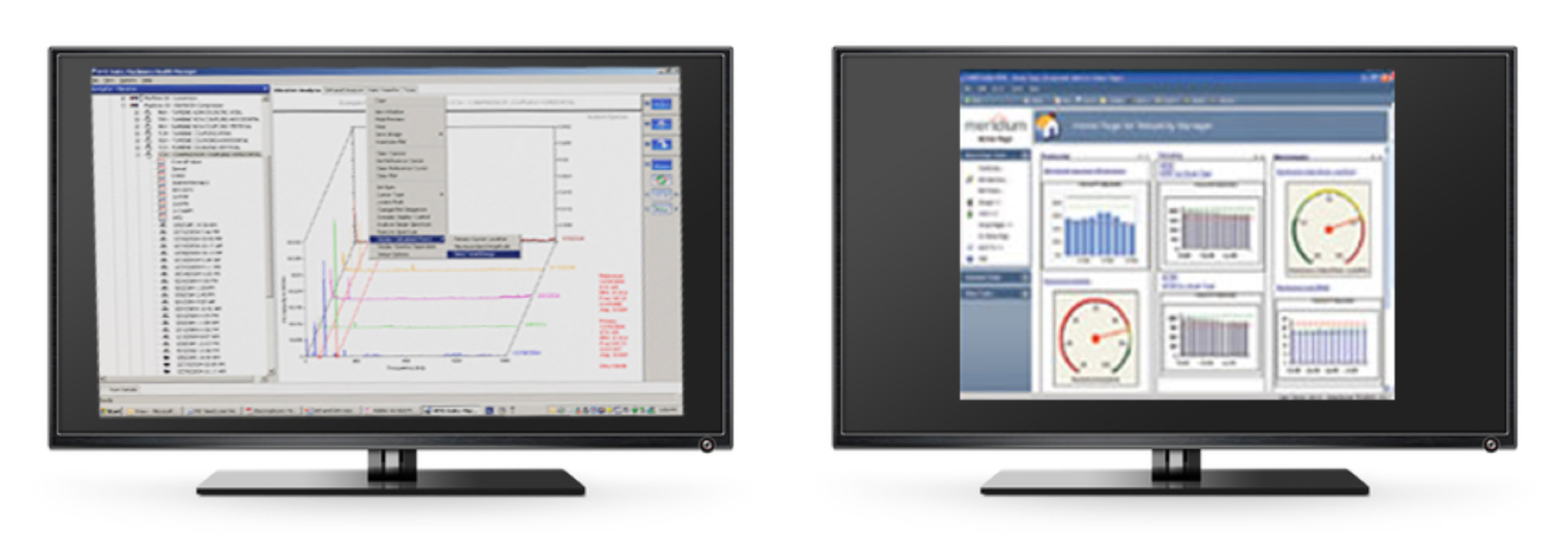
Take a similar approach for software shots as you would take with a physical product. Use a screen image of the software interface framed by a monitor or mobile device, set against a white back- ground. Do not include the accompanying CD- ROM case or any other artificial elements that distract from the interface image.
Specifically for the Product Catalog and Product Details Page, take the following approach:
Acceptable exceptions for software image presentations outside of the Product Catalog and Product Details:
Use the “Portraiture in Action” style showcasing an engineer in a control room using the software or shown outdoors using the software on a mobile device.
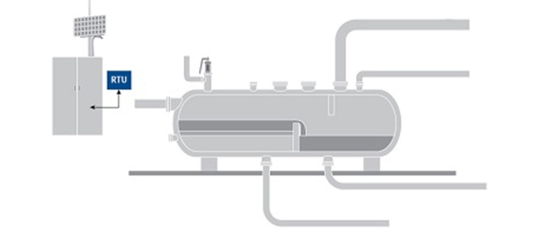
To express the technical nature of a product or the application of the product’s technology, use line or architectural-style drawings to convey information in a visually digestible format. This style is especially useful for articulating expertise at the industry application page level.

When none of the above options are available, turn to conference/event/office and high- quality studio stock imagery to fill in the gaps as needed. While not preferred, these images can still provide excellent value if they support the story, add emotional weight or act as proof points of Emerson’s expertise.


1. Product images are presented on desktop in a 1:1 container (444 pixel width x 444 pixel height container).
2. Your product image should be shot as close-up as possible, without obscuring its purpose.
3. Use white backgrounds only; try not to use unique angles. Try to shoot the product or family series straight on.
4. The product image can be re-purposed for Catalog, Related Products, Featured Product Carousel and Search Result thumbnails.
5. Secondary thumbnails (and video poster frames) on the Product Details Page can display different angles, different depths of field.
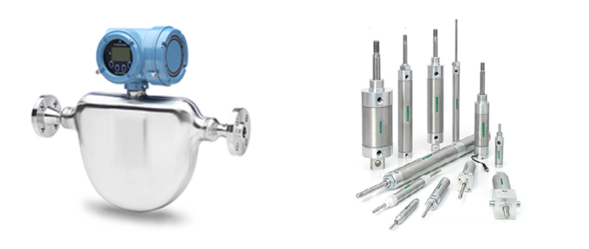
Sample Product Product Details Page Images map to Product Catalog Tiles (CAT002)

Sample Series Product Details Page Images map to Featured Product Carousel (C005)
1. For images that will be used as hero images (1440×500), upload pre-processed high resolution images and try to keep them under 500kb (.5mb). For images that will only be used as medium-sized photos (i.e., 400-800 pixels wide on desktop), keep them under 100kb when possible. For images that will only be used as thumbnails (i.e., less than 400 pixels wide), keep them under 25kb when possible. For images that must be larger file sizes to maintain quality, consider the total weight of the page and remove or re-compress images as needed.
2. Do not apply masking or add opacity to images you want to use for your hero images or VN001, as these have masks and opacity attributes preconfigured in CoreMedia.
3. Do not use clip art, collages or other alterations that deviate from the recommended image guidelines.
4. REMEMBER: Pre-process your high-resolution images in Photoshop (or equivalent software) so that they are optimized for the web. Try not to upload images to the CMS that are larger than 1 MB.

Sample Website Image This image could be re-purposed or cropped for use across the following components within CoreMedia: H002–H008, VN001–VN003, VN009–VN0013, P001–P006, C007–C014, C018, C026–C028.
• Appears crisp and detailed at large sizes on your screen
• Taken with a camera, or purchased from a stock imagery website
• Appears blurry or small on your screen
• Smaller than 25kb in file size (except for thumbnails), or downloaded from Google/search engine results without a usage license


The best image cropping/sizing results are NOT achieved outside of CoreMedia. Use CoreMedia tools to manipulate the positioning of your image for the best effect.
• Crop lines (dotted lines): Are auto-generated. Lines correspond to each image cropping displayed in the right panel. Lines can be adjusted for each image ratio by dragging to new positions in the ratio menu tab.
• Focal point (square with cross-hairs): Is auto-generated. Focal point can be adjusted for each image ratio by draggin to a new location in the ratio tab.
• Review only those images that will be used. It is not necessary to review every image.
• Preview cropped images in the browser since they may appear differently in the browser than the CMS. Note: While previewing your content page in a browser, flex the window width to verify cropped images are displaying as desired at various ratios.

Note that the amount of the original image displayed changes based on the aspect ratio for each device. The changes to the original image are not simply proportional.

Original uploaded image.

Aspect Ratio: 8:3

Aspect Ratio: 2.3:1

Aspect Ratio: 4:3
Some images fall outside of the recommended usage guidelines. These images are not necessarily bad or ill-conceived, but we recommend against using them in the name of creating a more consistent user experience, and bringing a uniform visual look and feel to the website. In short, if you can’t shoot it in the real world, it’s not part of the guidelines. Here are some examples we don’t recommend:

Doctoring photos to add technological artifices undermines our intended approach to images.
Avoid creating collages of multiple photographs.

Highly conceptual, but inauthentic. As with all clip art, please avoid.