Device Specs:
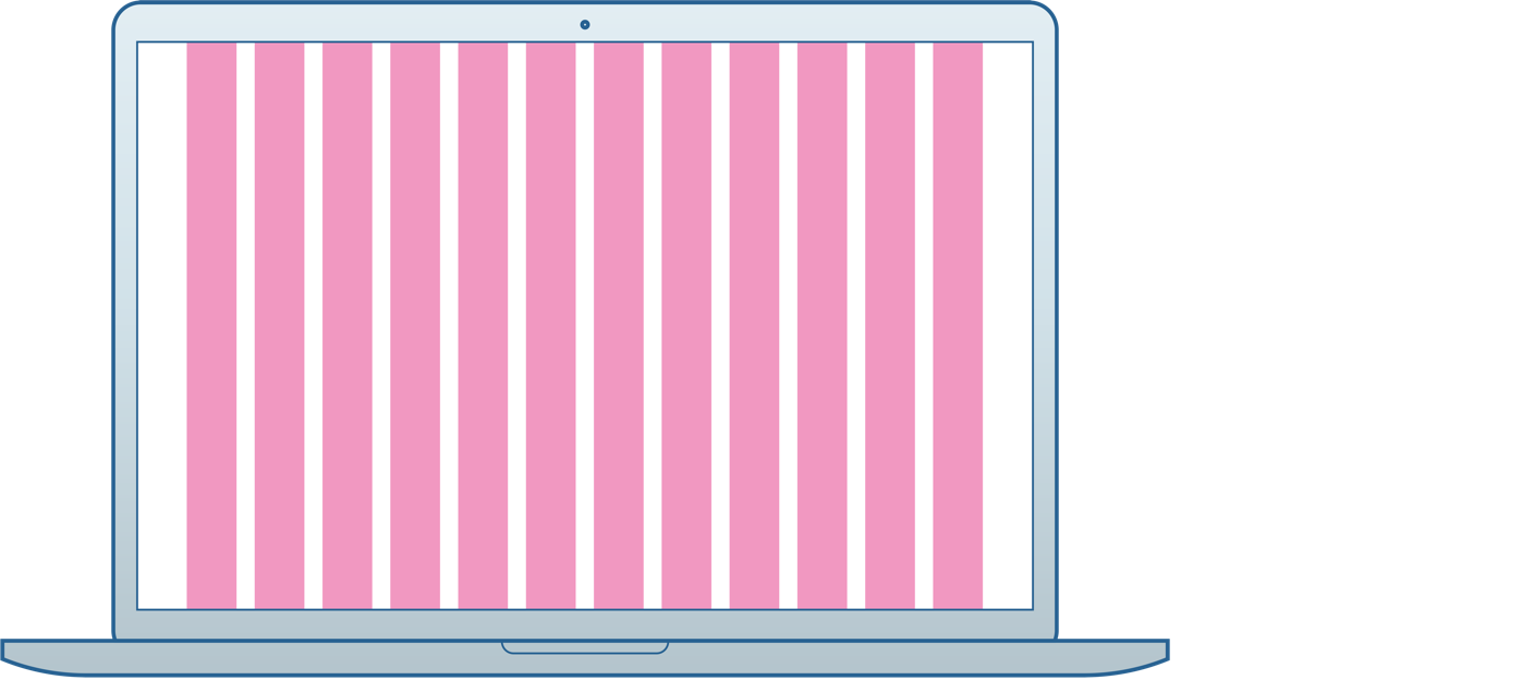
Desktop
Breakpoint: ≥1280px
Container: 1180px
Margins: 50px
Columns: 12
Col Width: 6.78% (80px)
Gutter Width (L/R): 10px
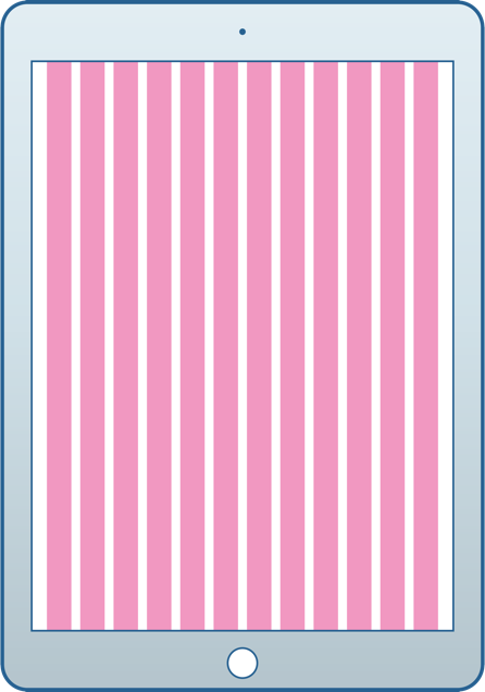
Tablet
Breakpoint: ≥ 768px
Container: 708px
Margins: 30px
Columns: 12
Col Width: 6.78% (48px)
Gutter Width (L/R): 6px

Mobile
Breakpoint < 768px
Container: 100vw - 20px
Margins: 10px
Columns: 12
Col Width: 6.78%
Gutter Width (L/R): 5px
Grid Layouts:

100%
Breakpoint: ≥ 1280px
Container: 1180px
Margins: 50px
Example: Homepage Hero

25% / 75%
Breakpoint: ≥ 1280px
Container: 1180px
Margins: 50px
Example: Product Catalog
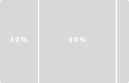
30% / 60% / 10%
Breakpoint: ≥ 1280px
Container: 1180px
Margins: 50px
Example: Case Study