Component Detail
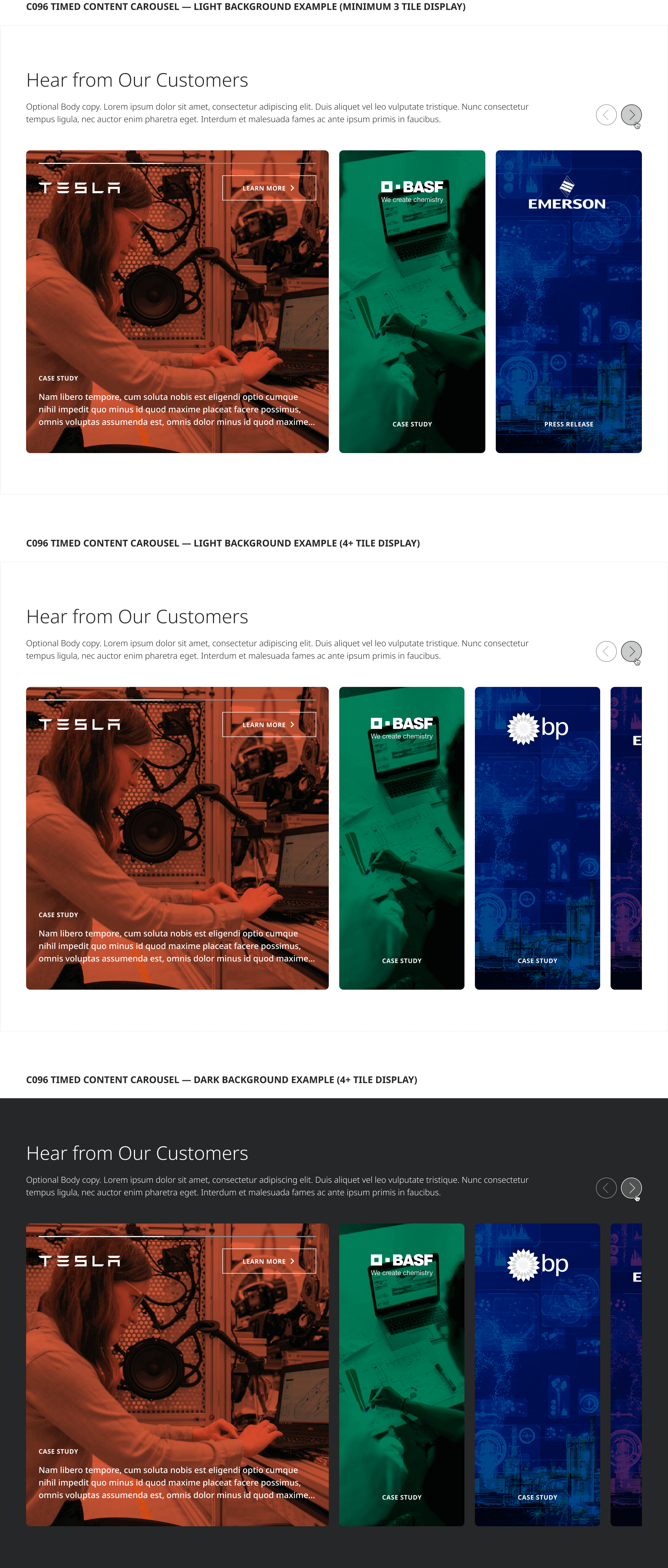
The Timed Content Carousel allows content editors to author a heading, optional descriptive body copy and 3-12 (recommended max) content tiles highlighting case studies, customer success stories, or other associated benefit or proof-point supporting content related to the larger page or section theme in which it appears. Each carousel tile includes a background image, reversed monochromatic logo foreground image corresponding to the associated customer brand, a content type label (e.g. “Case Study”), up to 3 lines of teaser description text and a Reversed style CTA Button. On page load the tiles display in their collapsed narrow state, and automatically expand successively until the user interacts with the carousel by either clicking the carousel toggles or an individual tile item.
Interactions
When more than 3 items are authored, carousel controls should progress the carousel and the active tile by 1 item in either direction corresponding to the Previous or Next toggle clicked.
When clicked, an inactive tile will become the currently active tile changing its content display to its expanded state, and collapsing any previously active tile to its default state and stopping the auto-play tile animation until the page is reloaded.
Tile CTA buttons should drive to the corresponding case study or article child page as applicable.
