Component Detail
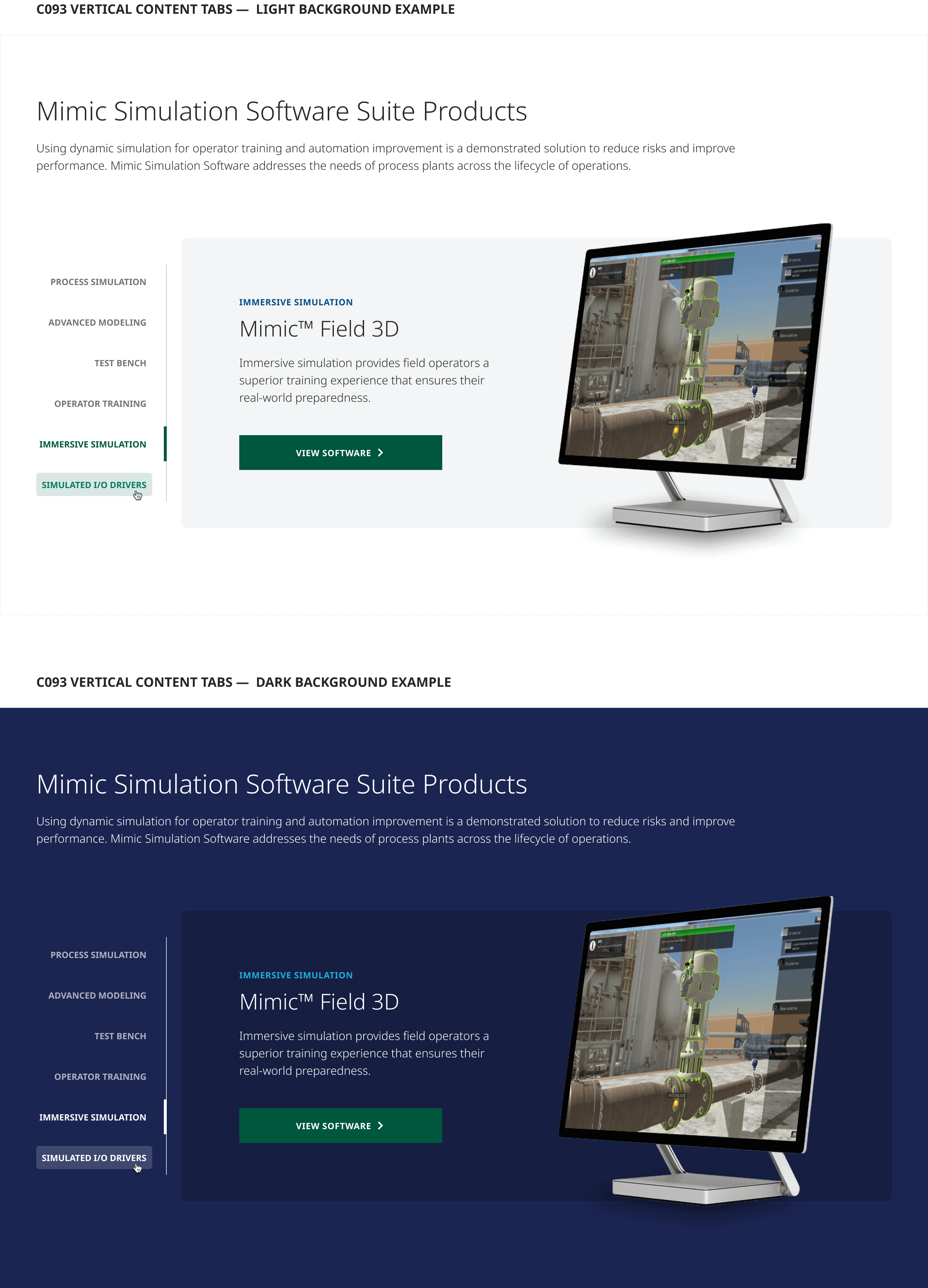
Vertical Content Tabs allow authors to showcase between 2–8 (recommended max) products in an engaging way. Each tab-associated card flexibly accommodates a brief product teaser consisting of an optional eyebrow label, product heading and descriptive teaser copy, with a product image and CTA driving users to learn more about the given product on a corresponding marketing or PDP child page.
**Note: It is recommended that the image assets used for this component should be formatted to display on transparent backgrounds in order to align with the modern design aesthetic intended for this component and avoid unwanted “boxing in” of the product imagery.
Interactions
Tab click interactions should display the corresponding card item content.
Card CTAs should drive users to the associated product marketing or PDP child page as appropriate.
