Usage Guidelines
When To Use
To tease a set of innovation stories, thought leadership pieces, or case studies.
When To Avoid
For product navigation
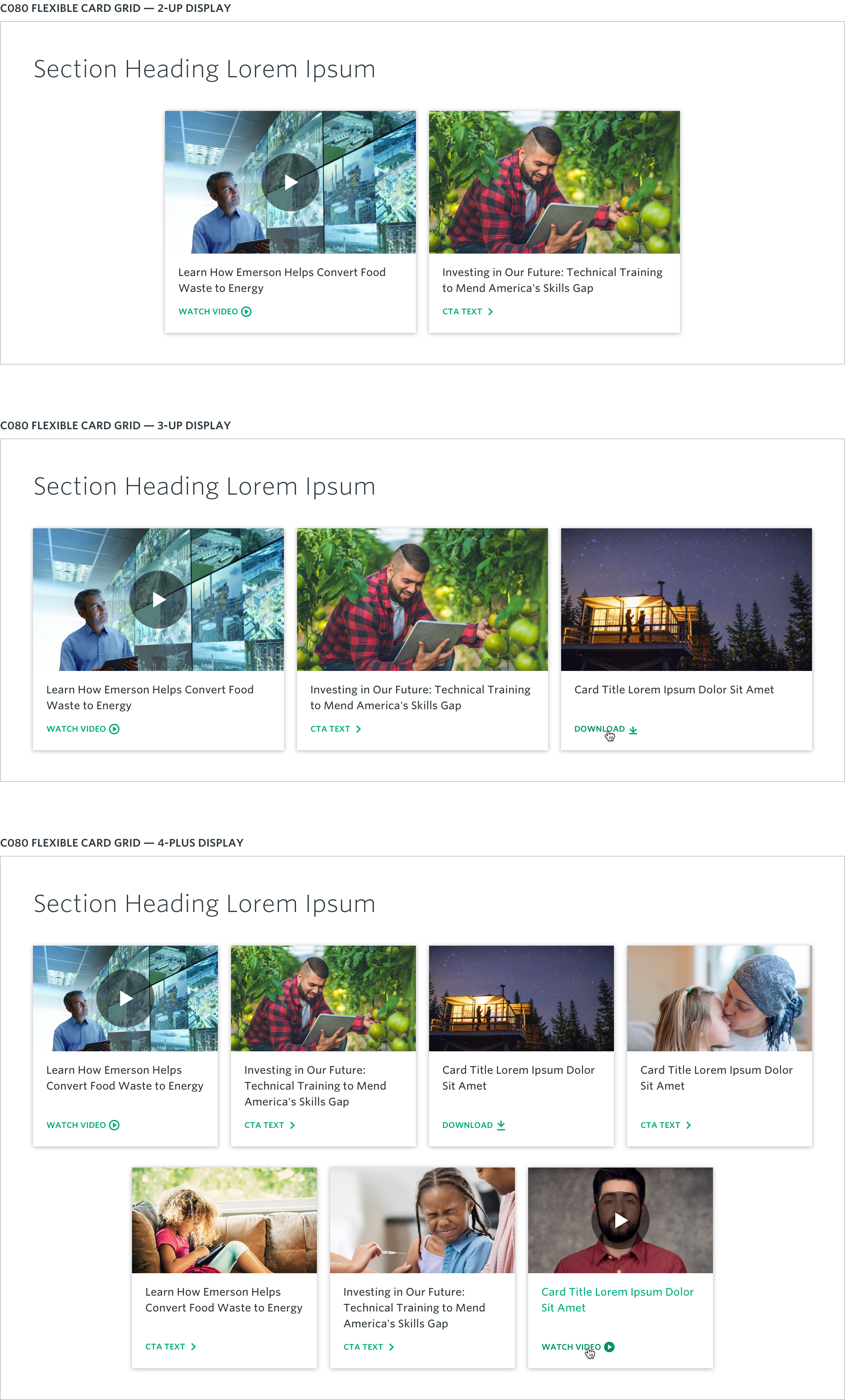
A versatile component that can be used to group 2, 3 or 4 pieces of teaser content in a row, with up to 8 max teaser items within 2 rows. Ideal to preview editorial content like Innovation or Perspectives stories.

A versatile component that can be used to feature a minimum of 2 — up to a maximum of 8 — pieces of teaser content. Cards are intended to flex their dimensions to adapt horizontally to the number of grid items displayed and vertically based on the amount of content they contain. For 2-3 items, cards will display at 33.33% the container width (excluding gutters). For 4-8 items, cards will uniformly display at 25% the container width (excluding gutters), with items in excess of 4 wrapping onto a new row. Row content should be center-aligned regardless of the number of cards displayed.
Content authors may optionally omit the teaser title (section heading) for this component when content is closely associated or intended to be “paired” with the component preceding it (e.g., Perspective lockup with C007B). When the teaser title is omitted, the space for the heading and spacing below it will collapse, shortening the spacing above the card content.
The entire container area of each card is interactive and can either be linked to an internal/external child page, trigger display of video content in an overlay or initiate download of a document to the user’s machine.
Section Heading (optional): 50
Item Heading: N/A (item intended to flex its height to fit content)
CTA Text: 25
Asset Size: 780px x 440px
Aspect Ratio: 16:9
Recommended File Weight: <35kb
Width: 540px
Height: 304px
Desktop: 16:9
Tablet: 16:9
Mobile: 16:9
To tease a set of innovation stories, thought leadership pieces, or case studies.
For product navigation