Usage Guidelines:
When to Use:
When you need to feature four or more brands
When to Avoid:
This component is meant to showcase Emerson brands; other uses are discouraged.

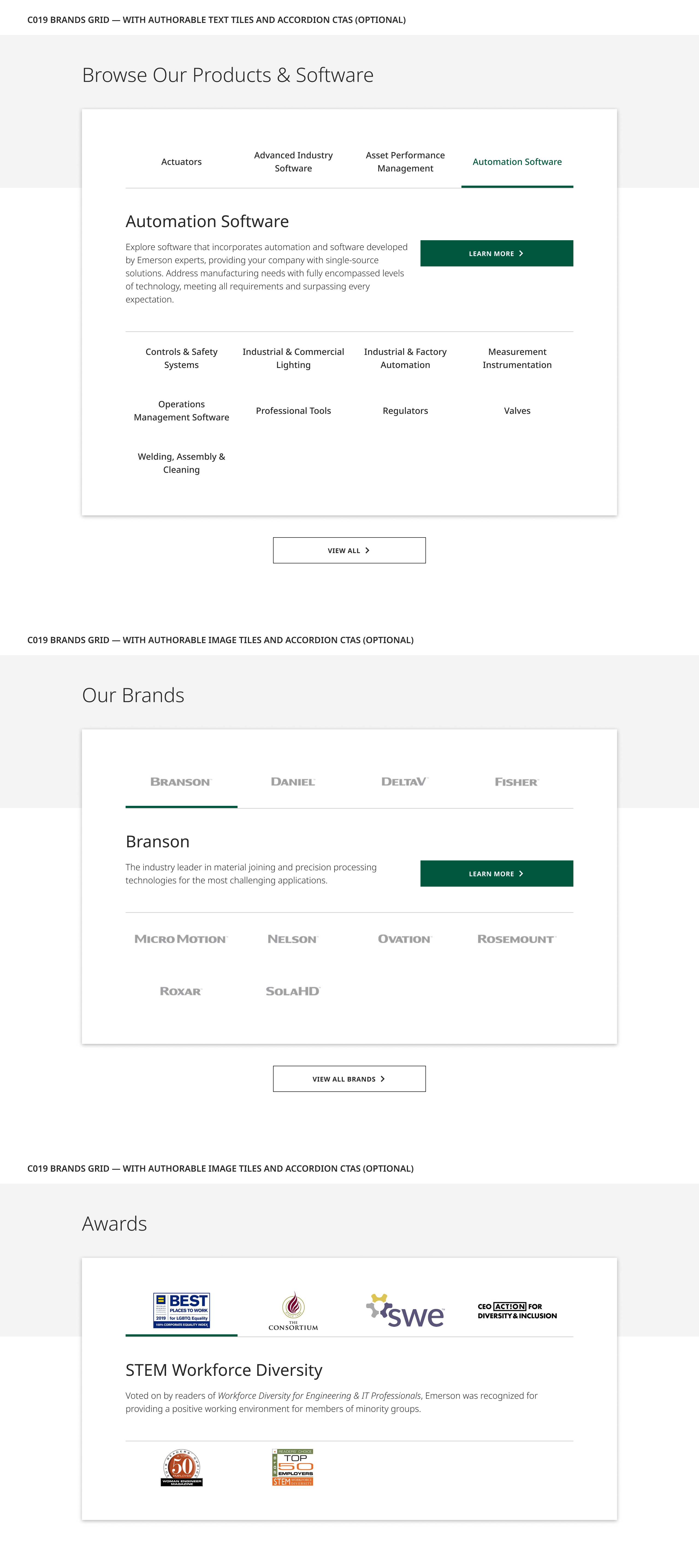
There are no image captions associated with this component, although on hover the brand logo reveals a short brand description.
The Brands Grid showcases Emerson brands, businesses in a given platform or category, or other related grouping of items such as awards, listed in alphabetical order. Each grid item includes a tile label featuring an image such as a brand logo and an accordion which consists of subheading text, a short description of its mission within the Emerson family, and an optional CTA button linking to an associated web page.
Alternatively, tile labels may be configured to display authorable text titles. While there is no hard limit on text title max characters, titles will automatically truncate at 3 lines of text.
Each tile reveals its corresponding accordion content on hover, displaying below the currently active grid tile. Optional CTAs drive to an associated Brand page or other related page for non-branded use cases.
Component Heading: 70
Tile Title (Optional): 50-60 (3 lines max)
Accordion Heading: 50
Accordion Body Copy: 125
Accordion CTA (Optional): 25
Asset Size: 370px x 185px
Aspect Ratio: 2:1
Recommended File Weight: <10kb
Width: 280px
Height: 140px
Desktop: 2:1
Tablet: 2:1
Mobile: 2:1
When you need to feature four or more brands
This component is meant to showcase Emerson brands; other uses are discouraged.