Component Detail
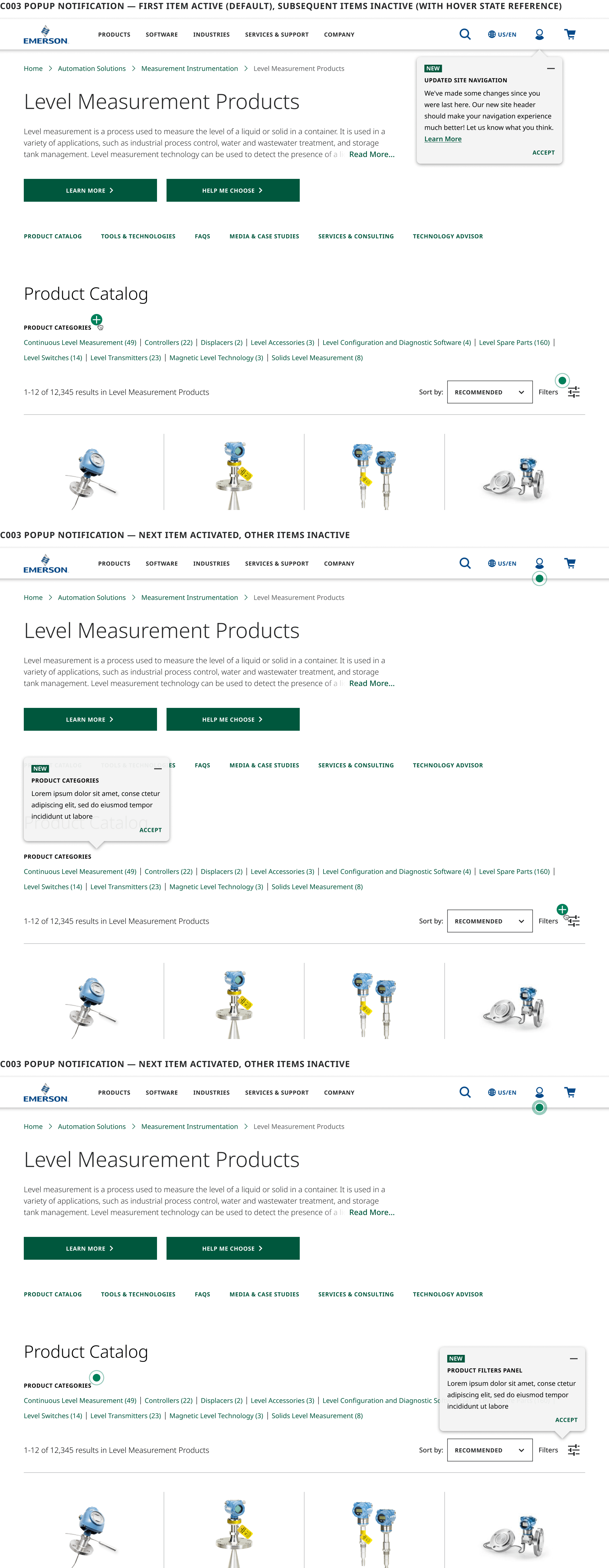
The C003 allows content editors to easily add notification message content to any component or page on the site, or multiple components within a given page. The express intent of the subcomponent is to inform users of significant changes to the user interface that may impact how they interact with the site.
When more than one Popup subcomponent appears on a page, the first one will display in expanded state with the others collapsed to an indicator beacon only. Each Popup on the page will successively change display states from collapsed to expanded when the previous Popup is either collapsed or dismissed by the user.
Interactions
Users may choose to either expand (beacon icon), collapse (minus icon) or Accept/Dismiss (Text CTA) Popup Notifications individually. When collapsed, the Popup remains visible on the page as an animated beacon icon which can again be expanded on subsequent click. When a user accepts/dismisses the Popup, it is removed from view and will only reappear on page reload.
