Component Active
C088 Flexible Full-Bleed Card Carousel Loop
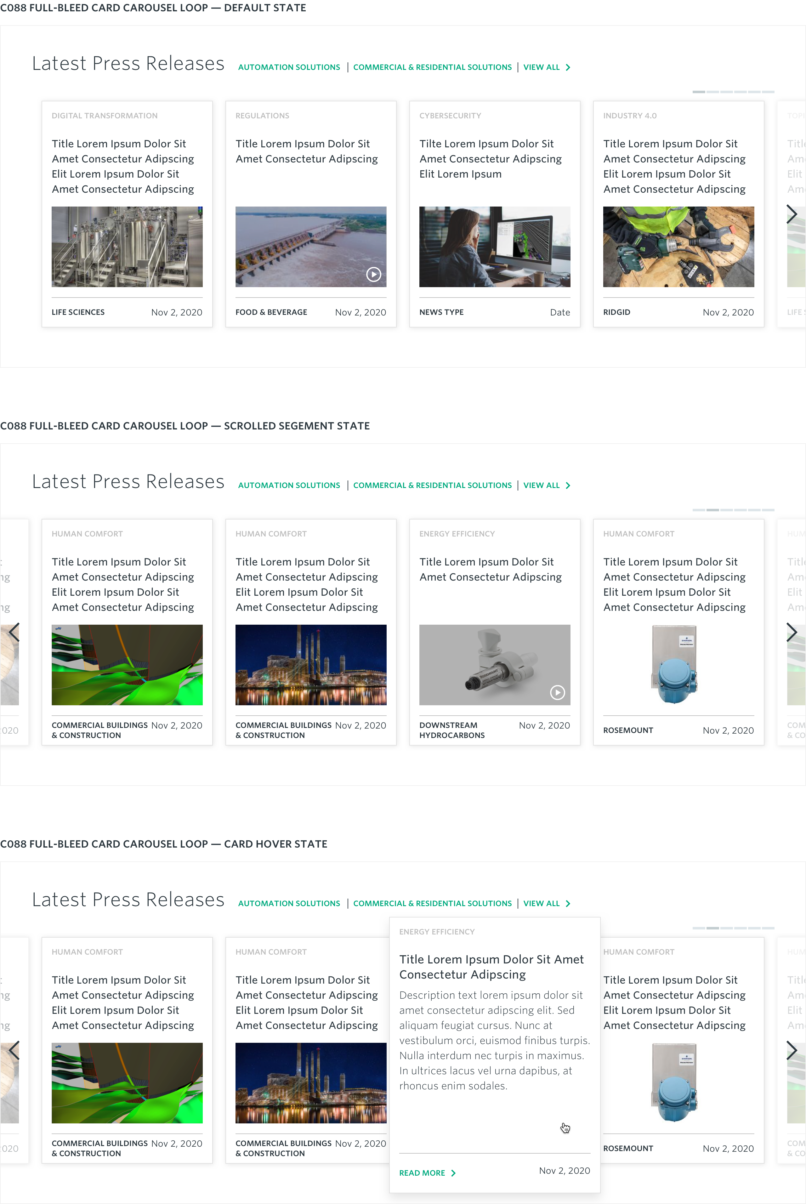
A responsive, full-bleed looped carousel component used for featuring up to 30 card items associated with the author-designated News Type.

Component Details:
The carousel can include between 6 and 30 news content card items of a given New Type (press releases, in the news, perspectives, innovations) designated by content tag.
By default the carousel displays items starting with the first card in the group and allowing users to scroll the carousel to the right to show the next carousel segment. Once interacted with, the carousel allows scroll navigation to both the left (previous segment) and right (next segment) in a continuous loop, and will always display a “peek” of the cards in previous and next segment groups just off the edge of the viewport.
Interactions:
- View All/Optional “view by” platform links direct users to the Newsroom Search Results page displaying news content items pre-filtered for the associated New Type and business platform (if applicable)
- Previous/Next toggles allow users to navigate through the carousel card items continuously in either direction (once enabled)
- On hover over a card item expands the card content size and reveals additional description, Text CTA and meta label content.
- On click interaction with an active (expanded) card drives users to the corresponding full-length news article detail page (Note: the entire content area of each card is interactive and clickable).
Specifications:
Max Characters
Headline: ~150 (6 lines max before truncation, 4 in default state)
Description Copy: ~350 (12 lines max before truncation)
Image Asset Dimensions
Asset Size: 480px x 270px
Aspect Ratio: 16:9
Recommended File Weight: <20kb
Image Display Sizes
Width: 320px
Height: 180px
Image Aspect Ratios
Desktop: 16:9
Tablet: 16:9
Mobile: 16:9