Update #15 – Social Share & Global CTA Enhancements
SEPTEMBER 20, 2022
Boost the social sharing engagement of your page viewers by leveraging the enhanced authoring flexibility of the S001 Social Share component. This CoreMedia component adds more configuration and customization options so you can easily adapt it to better support your content and preferred social platforms. Explore this and and a refresh on Emerson Call To Action (CTA) styles in this update of the Online Style Guide Release Notes.
COMPONENT ENHANCEMENT
S001 – Social Share Inline
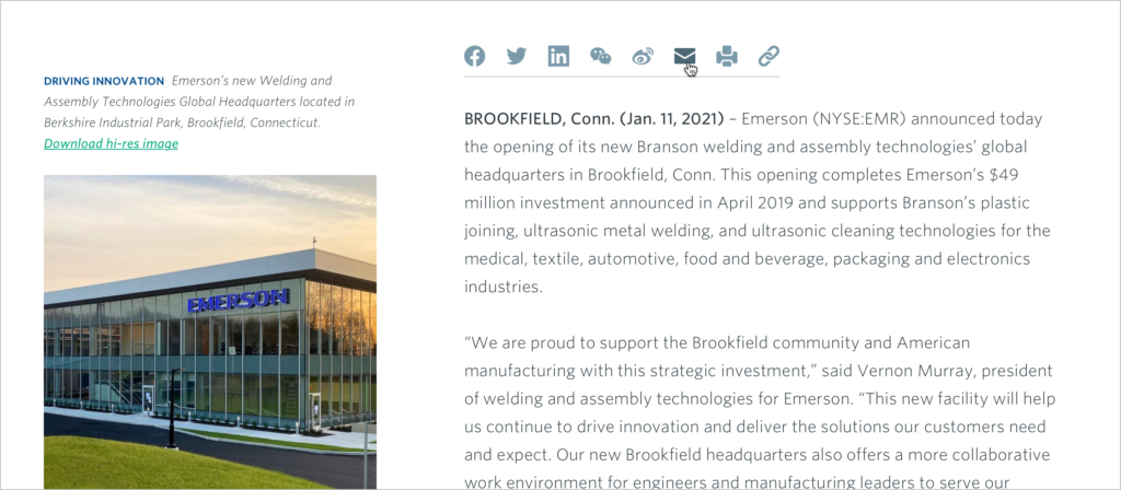
The Social Share Inline component allows content authors to place share buttons on certain site pages such as the Expertise Feature in which content is created to be shared, or within article pages such as press releases, case studies or thought leadership pieces. Ideally the S001 component should be displayed right below the Hero component of the page.

Design Enhancements
The refreshed component design includes an updated Facebook icon and new “Copy Link” option (chainlink icon shown above). In addition, the icons now display at a larger size to enable easier interactivity and have also been re-styled in more prominent, brand-related color schemes (for default and hover styles) to improve the contrast and readability of the assets across all devices. Learn more on the OSG Component page.
Authoring Enhancements
Several authoring and optional configuration enhancements are now available in the updated S001 component. Among these are the ability for authors to customize a unique collection of their preferred social platform links and add new icon assets to the options already available for use. Additionally, authors can customize their own social card image to display next to their post as an alternative to the standard Emerson logo (for OpenGraph) and configure their tweet styles multiple Twitter card type options (Twitter only).
To learn more about all the flexible configuration options and how to leverage the full flexibility of this enhanced component, visit the Content Editors’ Guide for authoring guidelines and helpful how-to’s.
COMPONENT ENHANCEMENT
Global CTA Updates
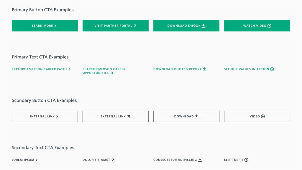
Text and Button CTAs have been enhanced globally across CoreMedia to include new content-descriptive iconography to better convey what users can expect when they click a given CTA. The new icons correspond to the CTA’s associated content type including Internal Links, External Links, Downloads and Videos. In most authoring cases the CTA icons will be dynamically generated by the platform based on the content type being linked to, such as download, video, and external link. If a content item is wrapped in a Teaser, the system will default to the basic “greater than” carat that shows for a page even if the target content is another type. Authors should take care to use the correct content type to optimize the user experience.

As a reminder, CoreMedia CTAs utilize a specified design hierarchy to help emphasize the importance of the corresponding linked content. This hierarchy includes options for Primary, Secondary, Tertiary and Reversed (white on dark) CTA styles. Similar to the CTA icons, most components will generate the applicable CTA hierarchy style automatically, but there may be times when editors can configure these styles manually. When featuring a single CTA, it is generally recommended to use the Primary CTA style. When authoring more than one CTA in a component with configurable CTAs, editors may opt to display two primary CTAs or one (leading) Primary CTA and one supporting Secondary CTA. Tertiary and Reversed CTA styles are typically restricted to certain components and generally not available for other use cases.
