Usage Guidelines
When to Use
Use to delve into a topic directly below the Hero component.
When to Avoid
Avoid using this component for long-form content.
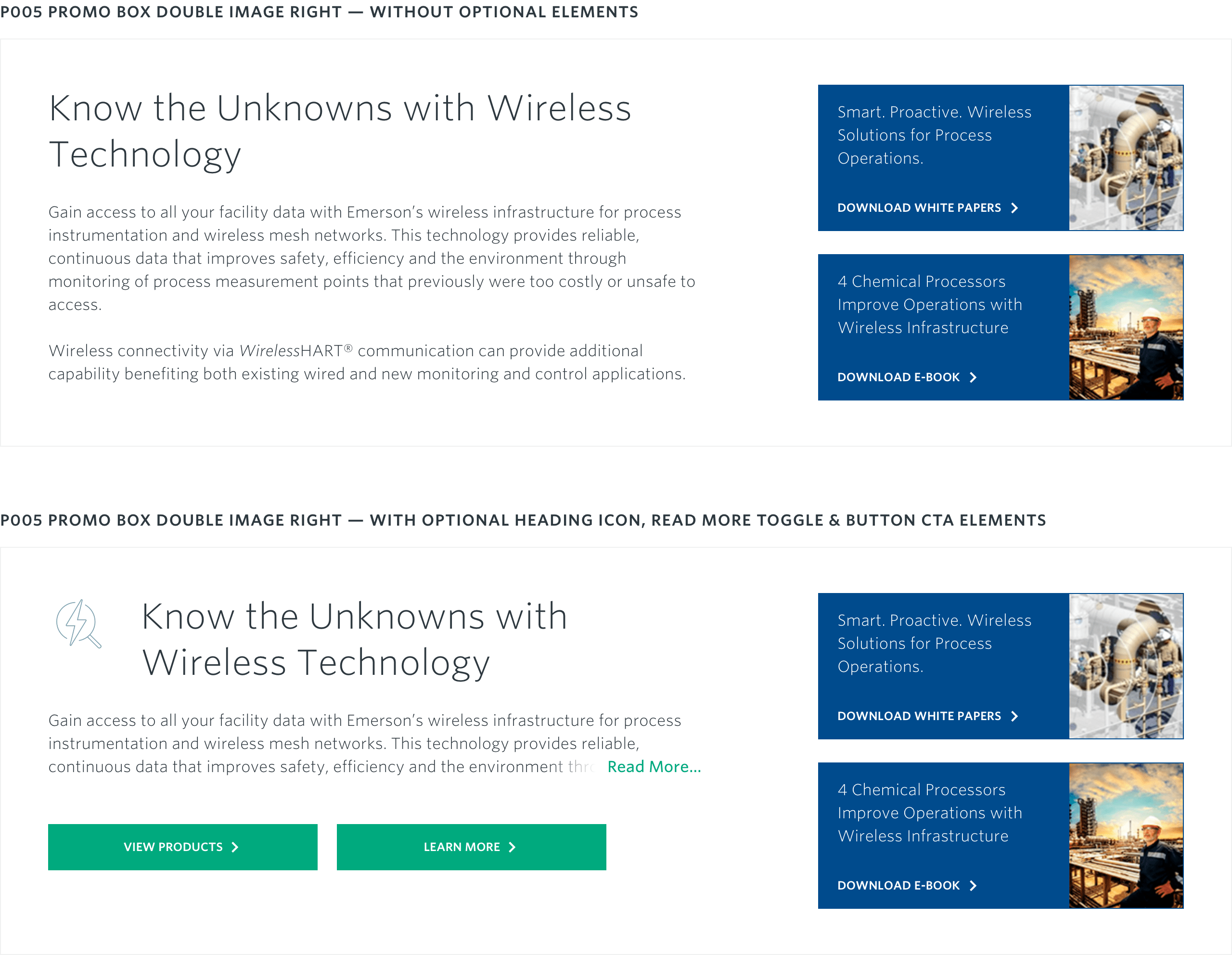
A value proposition paragraph with two supporting promo boxes and images to the right.

A Promo Double Right w/ Images include up to two descriptive paragraphs supported by two small, standalone “promo” boxes that include supporting calls to action. These “promo” boxes can be used to promote a case study, webinar or any other type of information that would be useful to the user in context. Up to two CTAs beneath the body copy are available to be added.
CTAs should link to related content. CTA buttons can be added beneath main body copy.
A read more toggle can be added to the component, truncating the body copy to 3 lines of text by default. When the toggle is clicked, the rest of the content will appear below as normal.
Note: Each optional element is authorable individually and in combination with each other.
Main Headline: 60
Body Copy: 300-500
CTA Button: 25
Promo Box Title: 60
Promo Box CTA Text: 30
Asset Size: 360px x 480px
Aspect Ratio: 3:4
Recommended File Weight: < 25kb
Width: 120px
Min Height: 152px
Desktop: 3:4
Tablet: 3:4
Mobile: 3:4
Asset Size: 128px x 128px
Aspect Ratio: 1:1
Recommended File Weight: <5kb
Display Width: 64px
Display Height: 64px
Use to delve into a topic directly below the Hero component.
Avoid using this component for long-form content.